
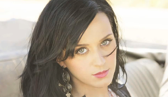
A common convention in Katy Perry's work is most of her music videos consist of her looking very natural and her album covers are the complete opposite. For example the two pictures above: The first picture is a still from Teenage Dream, and next to it is her album cover. This is a convention that we didn't want to follow. We wanted to stick to most Indie Pop artists and keep one theme throughout. We kept our video very natural, as for our ancillary we kept the artist looking very natural however we were quite artistic with the background and the font.


I created our font to be very similar to Katy Perry's as it is her signature font which she uses on all of her albums. We didn't have it identical as we wanted to have some originality to our work. I think this font compliments our project very well as our music video was a lot of fun especially throughout the narrative shots. I wanted the font to contribute to the kind of artist we wanted to create. The font is colourful, bold and quirky which is exactly how we wanted our artist to be.

This example of one of Katy Perry's album covers has appeared frequently in my blog as this is where we took a lot of inspiration for our ancillary task. We used a similar colour scheme to her cover as we liked the 'candy' look it had and how eye catching it was. A lot of her album covers and music videos involve the background being clouds which is why we chose the background we've used. To keep the continuity between our video and ancillary task, we took all of our photos in the studio as most of out video was filmed there. We wanted the pictures to be crisp and clean so we used SLR Digital Cameras.
Throughout the ancillary task I am wearing the same costume to keep the same look running through it as we want it to look like a compete package. One mistake we did make was the costume being worn for the ancillary isn't featured in the video which if we could go back and re-film we would make sure was in it. I kept my hair and make up the same for both pieces as we wanted the artist to be recognisable and to keep a theme running through the whole project. We wanted the ancillary to be full of bright colours as the music video we created is very happy and I am always smiling so we wanted to reflect that in our other practical work.
We have followed the conventions of our research very well with few allowances. I wanted to ensure that all the inserts of our digi-pack fitted in nicely together and I think I have achieved that. I have cartoonized the album cover slightly, and to keep this I tried to make the digi-pack look also 'cartoony'. I have achieved this mostly through the font and the choice on colours - candy pink and white. We feel that our ancillary task backs up our music video 100%. We have created a clear artist which the target audience will be able to relate to.
No comments:
Post a Comment